Documentation
User Guide & Quick Reference
Everything you need to know about creating, editing, reordering, and exporting interactive charts with Pinkgraph.
SECTION 01
Getting Started
Overview of the dual spreadsheet & graph workspace.
SECTION 02
Entering Data & CSV Import
How to edit matrix cells or upload CSV files.
SECTION 03
Row & Column Operations
Adding, deleting, and reordering columns.
SECTION 04
Chart Types & Customization
Bar, Line, Area, Pie, Radar, and stacked toggles.
SECTION 05
High-Res Exporting
Export HD PNG, HD JPEG, SVG, and CSV data.
SECTION 06
Keyboard Shortcuts
Fast navigation and editing hotkeys.
01
Getting Started with Pinkgraph
Pinkgraph combines an interactive spreadsheet grid with real-time chart rendering. Data entered on the left instantly updates the visual graph on the right.
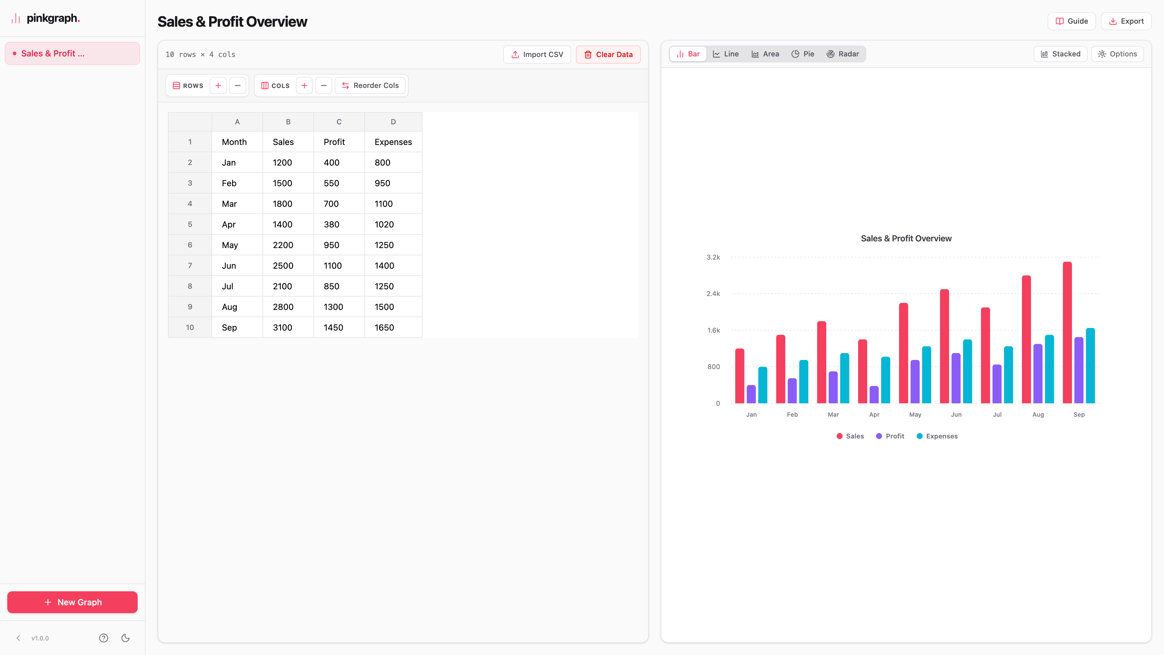
- Privacy First: All your graph data is stored locally in your browser's LocalStorage. No server databases or tracking.
- Multi-Graph Workspace: Create, rename, duplicate, and manage multiple graph sheets using the left sidebar.
- Responsive Workspace: Switch between Dark Mode and Light Mode anytime using the sidebar theme toggle.
02
Entering Data & CSV Import
You can edit cells manually or import existing spreadsheet files directly into Pinkgraph:
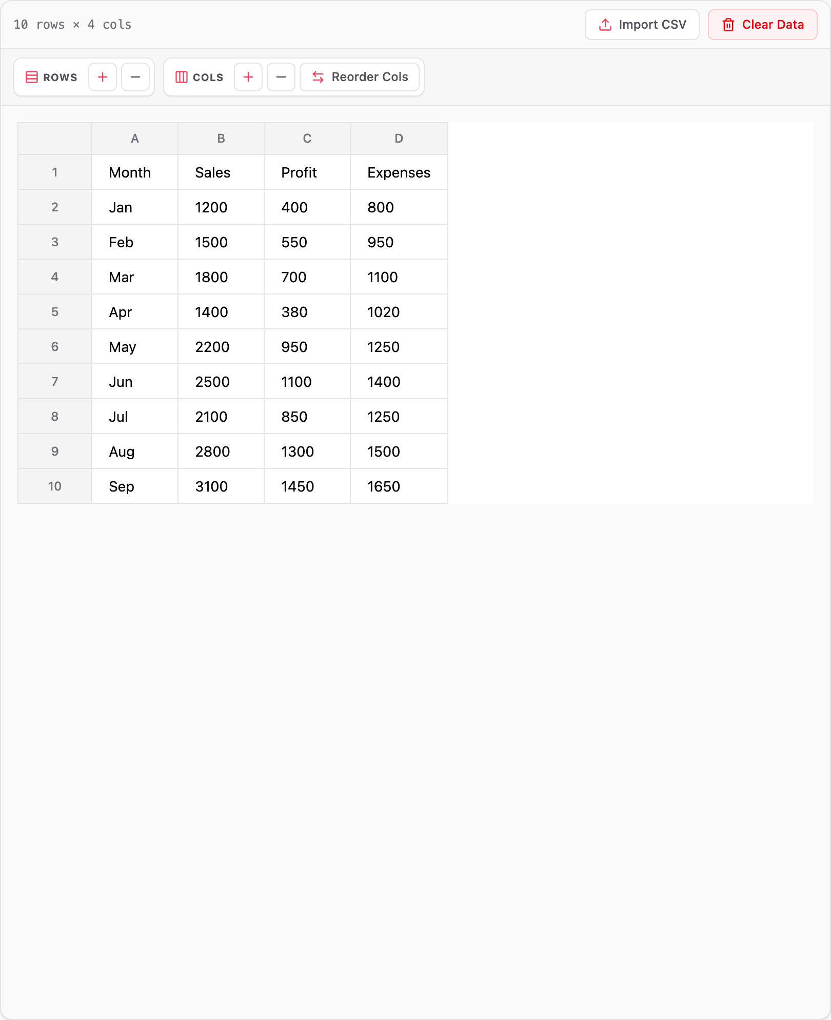
- Column 1 (X-Axis): The first column defines the category names (e.g., Months, Products, Categories).
- Columns 2 to N (Series Data): Columns 2 onwards represent numeric data series (e.g., Sales, Profit, Expenses).
- CSV Import: Click
Import CSVin the top grid toolbar to upload a.csvfile. Pinkgraph automatically parses headers and numeric values.
03
Row & Column Operations
Manage spreadsheet structure easily with dedicated control groups in the grid toolbar:
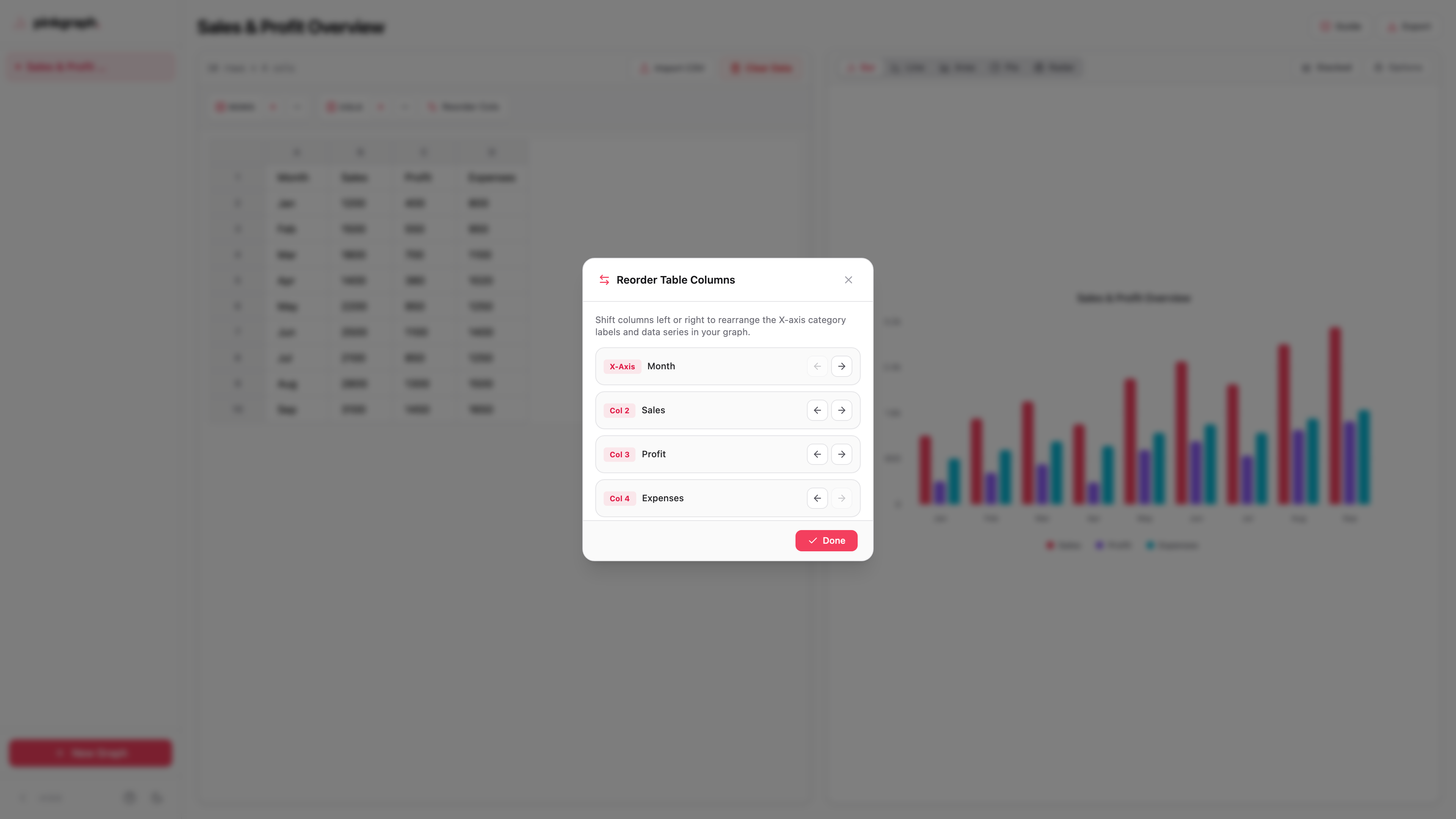
- ROWS Group: Click
+to add a new row or-to remove the last row. - COLS Group: Click
+to add a data column or-to remove the last column. - Reorder Cols: Click
Reorder Colsto open the column shifting modal. Move any column left or right to change X-axis categories or series order.
04
Chart Types & Options
Pinkgraph supports 5 interactive chart types with instant toggle controls:
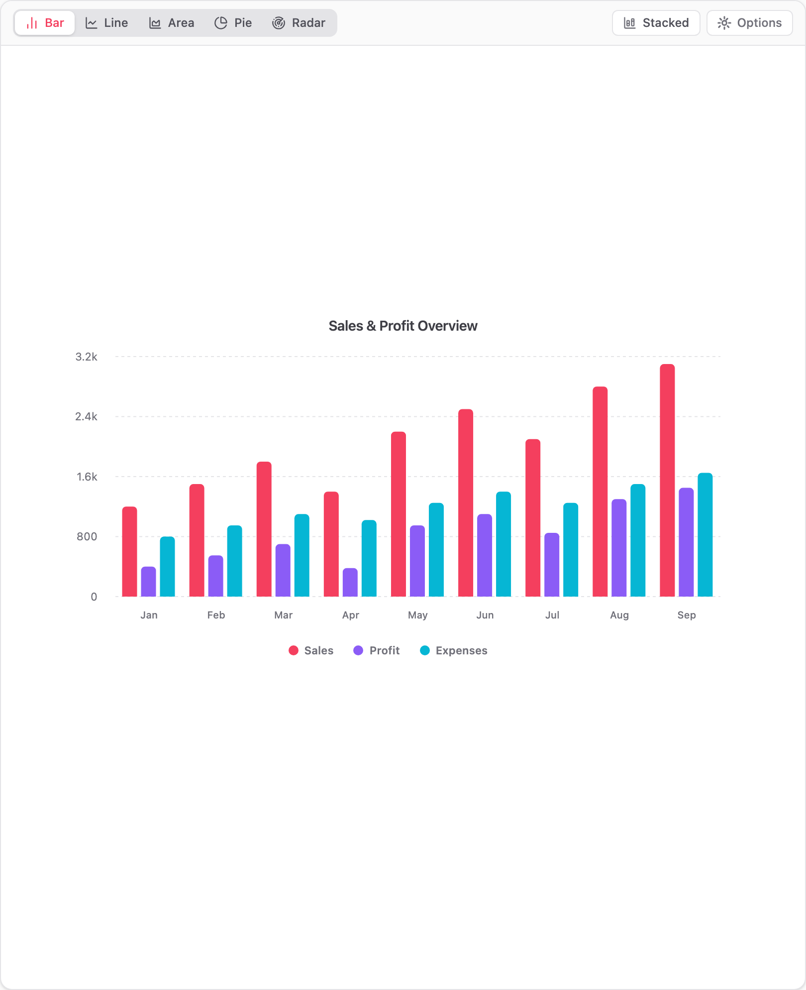
- Bar Chart: Great for categorical comparisons. Supports Grouped and Stacked views.
- Line Chart: Smooth curves ideal for continuous time series trends.
- Area Chart: Shaded area charts for cumulative metric tracking.
- Pie / Donut Chart: Proportion breakdowns relative to total.
- Radar Chart: Multi-axis star charts for multi-metric comparison.
- Display Options: Toggle
Show Graph TitleandStacked Viewunder the Options panel.
05
High-Resolution Exporting
Export publication-ready graphics and raw data from the top header Export menu:
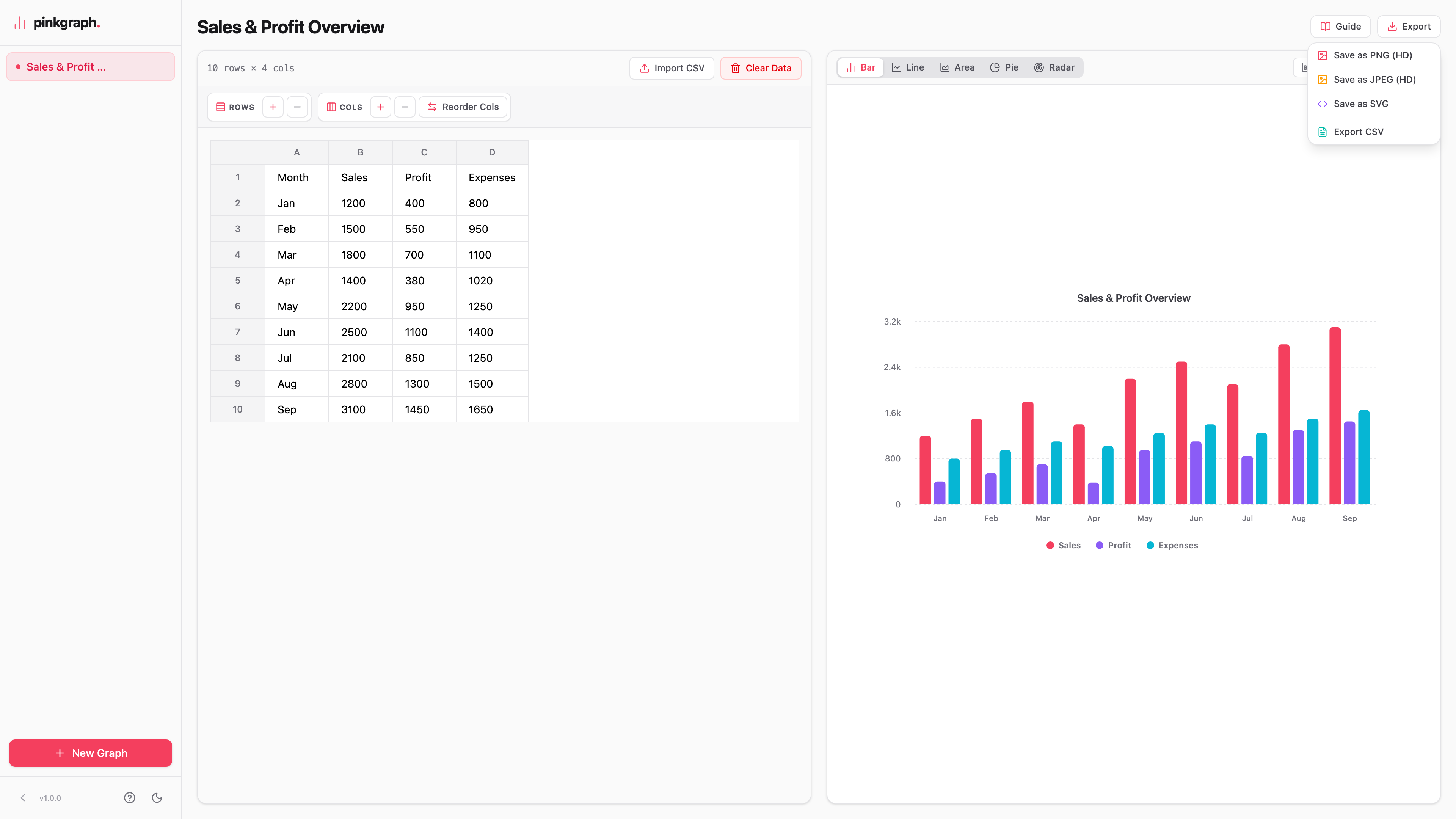
- Save as PNG (HD): 4K ultra-high-resolution PNG image with 4x pixel density.
- Save as JPEG (HD): Crisp 95% quality HD JPEG image for presentations and web sharing.
- Save as SVG: Scalable vector graphics file for graphic design and Illustrator.
- Export CSV: Download the raw grid matrix as a standard CSV file.
06
Keyboard Shortcuts
| Action | Shortcut |
|---|---|
| Move to Next Cell | Tab or Enter |
| Move to Previous Cell | Shift + Tab or Shift + Enter |
| Auto-Add Row at End | Press Enter on the last cell |
| Cancel Cell Edit | Escape |